Unreasonable Effectiveness of Metadata
Metadata
Metadata could be translated as data about data if we want to translate ‘mot à mot’. Generally, it defines what the data is about and gives some descriptive information around that. Still quite abstract huh? If the content of email is data, then sender, receiver, date and time could be considered as metadata. Metadata could be quite important when data is not available or unobservable due to various reasons.
One of the reasons why they could be collected quite freely and and abundant is because apparently it does not have to go through the same privacy concerns unlike data goes. Moreover, it is likely that its digital footprint is much smaller than data and this leads to efficient storage, computation, analysis and inference. As its name suggests, it is an abstraction of the data it sits on top of the data; it does not necessarily tell the story, but that does not mean it does not reveal anything about data itself. Contrarily, it may expose a lot of interesting patterns and even not just about data.
Gmail Outage
Last week Gmail had an outage and users could not use their Gmail accounts for almost one hour.
Consider this scenario, we cannot observe the outage of Gmail(after all it just prompts an error, temporary error 502), but we have all of the metadata of users who use Gmail. It would be quite easy to infer that there is something wrong with Gmail infrastructure and this could be done pretty quickly and efficiently assuming we have all of the statistics and email metada information of users. Looking at the data of the users has another important advantage; you actually do not care if the infrastructure works but if your users could actually use your service. But is there a pattern to begin with?
Gmail Usage Analysis
So, I used my work gmail account that I used from beginning of June 2013 up to January 2014. I looked at received email and sent email times. The results was quite interesting. Although there are a lot of third party applications which shows some usage statistics, I found none of them secure and reliable. So, I pulled the data from Gmail using standard library imaplib. Apart from easiness, you could have control of all of the folders in your email for arbitrary time intervals whereas third party applications generally either gives predefined(inbox, sent) or put restrictions in the time interval. Python has a batteries-included approach which works quite convenient at the times when you want to do implement something that is already implemented in the standard library.
Received Emails
Emails Per Day
For daily counts of emails, Monday and Thursday has two days less than other days this is due to the federal holidays. But I must say most of the received emails are from project management web app that we were using. When I looked at my received emails, I see mostly notifications rather than “emails”.
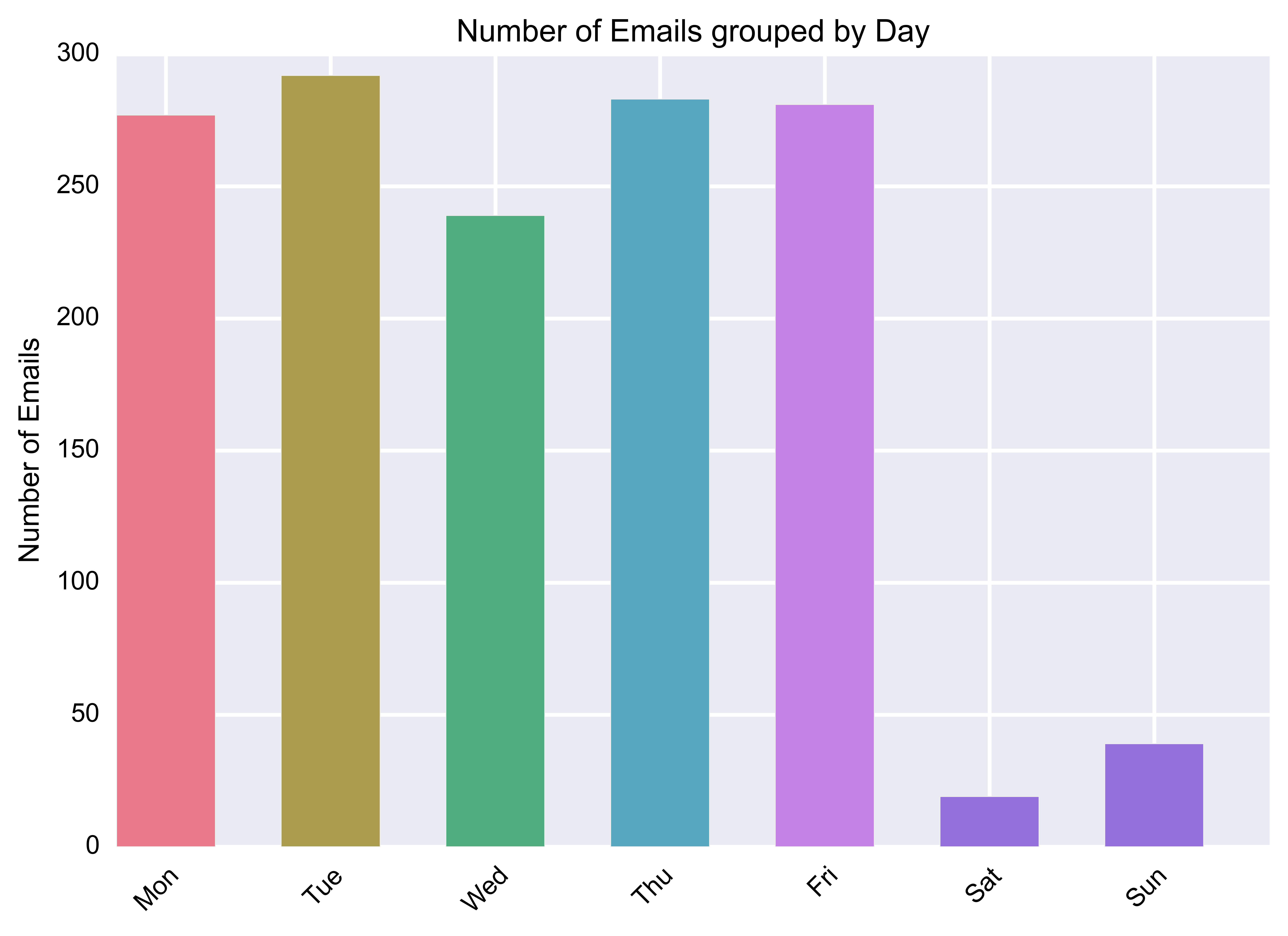
What do we infer from the above graph? For some reason, we have less number of emails in Wednesday. Could it be we were working less in Wednesday? Actually, yes. We used to have company meetings in Wednesday. This may not change a lot for one person, but if you consider all of the people in the company spent their times on the meeting, then total time spent becomes ‘meeting-hour * number-of-people’ which apparently has an effect on the total number of emails.
What!, you were receiving emails on Sunday?
So, we were a distributed team and Israeli team took vacations on Friday and worked on Sunday. Those emails are mostly due to the activities and emails from Israeli team. This would also lead to high number of sent emails on Monday as you will see later. What I found interesting is that, more or less most of the days have same number of emails. Even though it feels like beginning of the weeks are stressful and hectic, apparently if we sum the number of emails per day, we get similar number of emails for each day.
Emails Per Hour
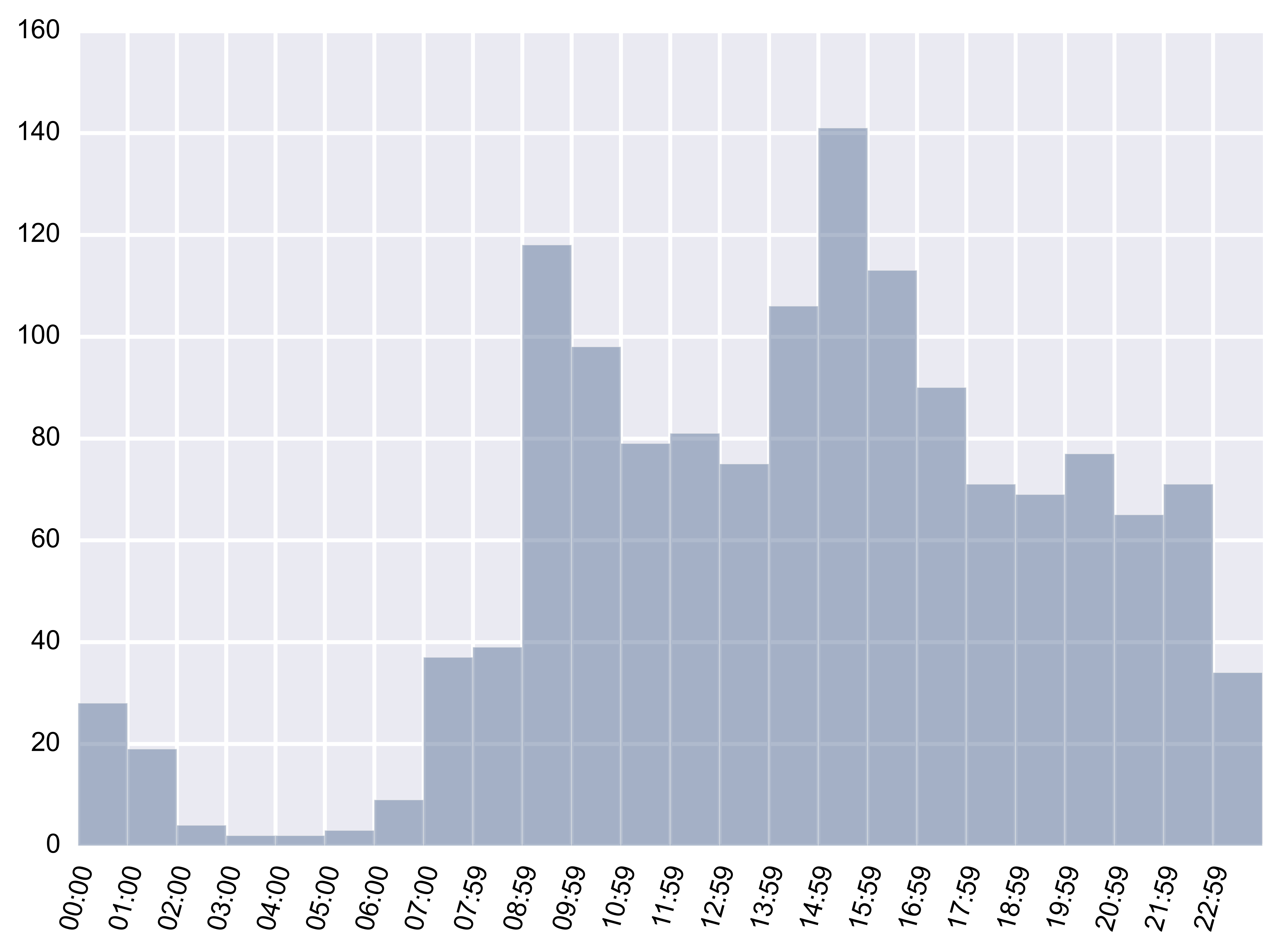
The following graph actually explains what type of email activity shows a distributed and a team which has quite different timezones(USA, Europe, Israel).
Emails Per Hour Over Time
There is a “inactive” time zone which corresponds to between 3 am and 6 am EST. However, as different people have are in different time zones, generally the inbox email flow seems to be continuous except inactive time zone. 
As I have mentioned, the emails are mostly project updates, notifications and lastly and in a small percentage emails. What is more interesting is actually sent folder as it will reveal my email and for some extent working behaviour.
Sent Emails
Emails Per Day
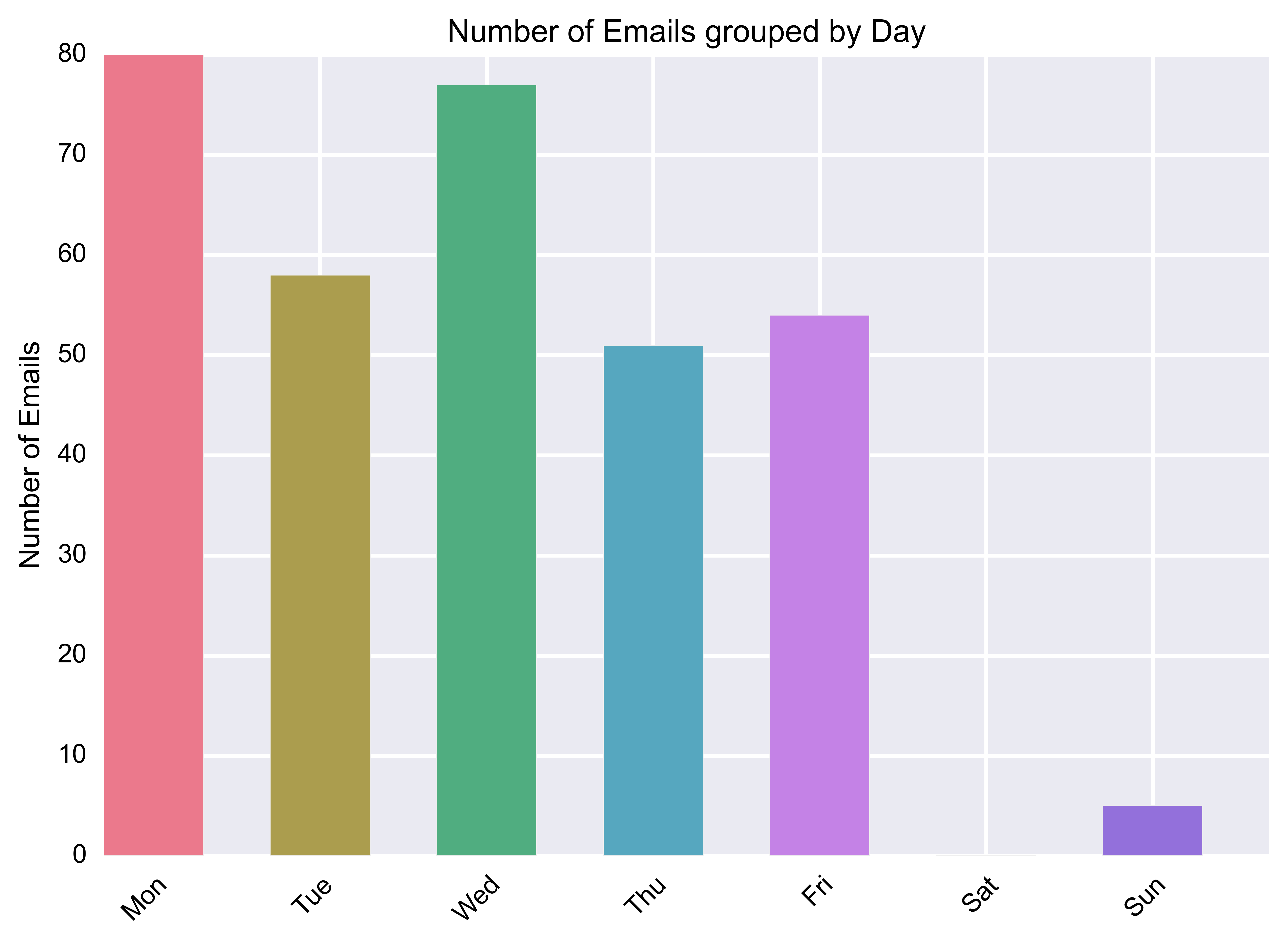
Remember, when I said the beginnings of the week was stressful and hectic, it actually was. Generally, every week either task that I was assigned in the previous week was completed or it the method/algorithm/approach was not working, then we switch to other approaches. Therefore, first two days of the week are mostly spent of trying to understand the task and try to figure out what is actually needed. This process brings a lot of questions and leads to high number of emails and communication. And, yes I was answering emails on Sunday time to time.
Emails Per Hour
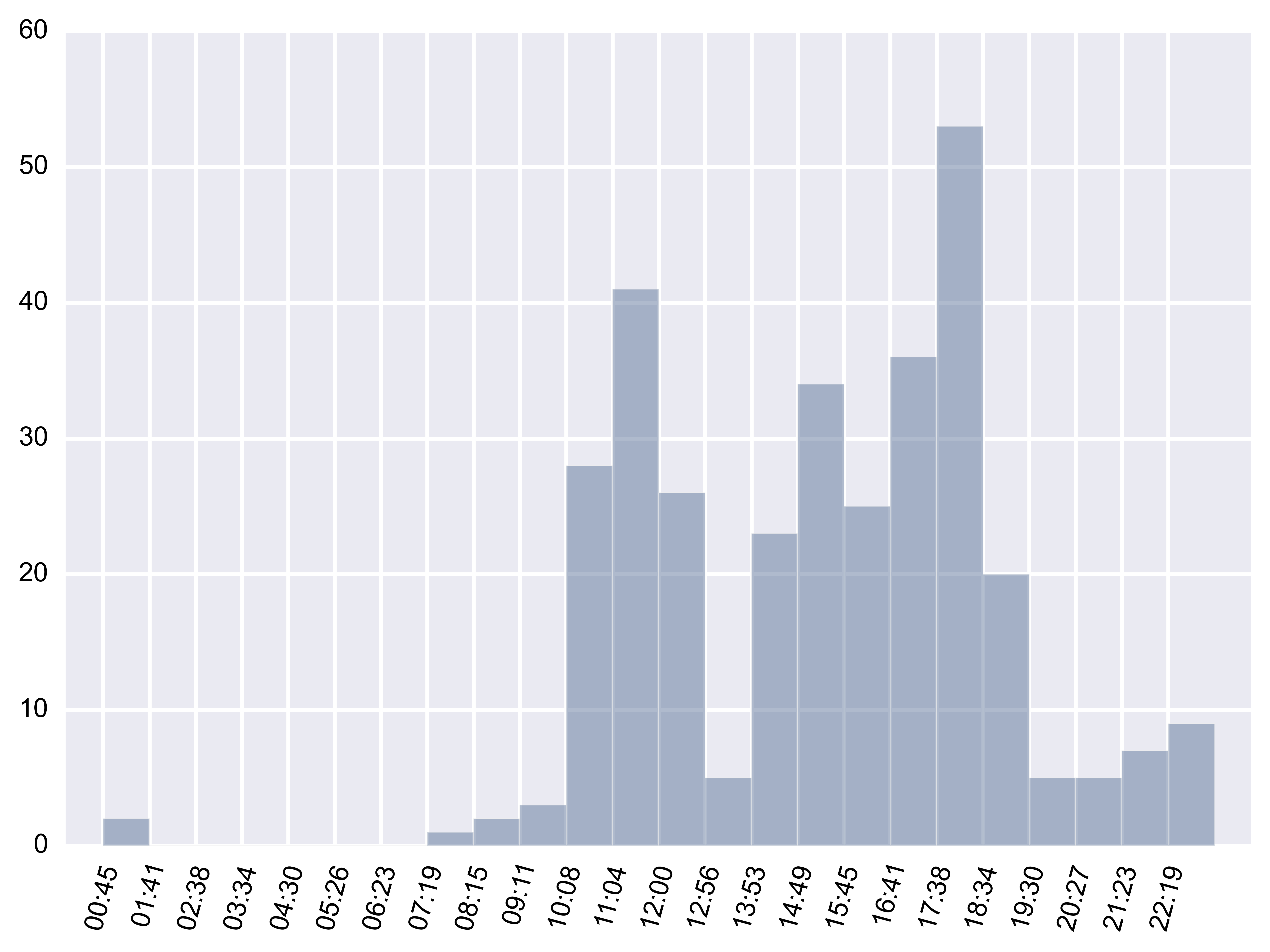
The following graph actually explains a lot of my daily activity. Can you see when I have lunch? Or when I commute to work or when I leave from the work? Such daily behavior probably also affects my reactions and responses to advertisements that I see on web. My probability of responding to a restaurant or a meal ad around noon peaks whereas after 1 hour, I would lose all of my interest to food. Similarly, Uber ads around 9 am and 6 pm would may mean a lot to me whereas I am quite unlikely to respond to the ads at other times.
I also have two other accounts of in gmail which I use for my personal needs. With combination of those data, more or less my daily activity are actually could be inferred quite accurately from my gmail usage. And, do not forget we did not yet go through my emails but only metada, timestamps of emails. Yet, even this much of data reveals a lot of my daily activity.
Emails Per Hour Over Time
From the following graph, could you see when I took vacation or switched to another job so that my daily activity becomes almost zero? Could you also see the activity in my transition and how it gets moved to non-working hours (mostly).
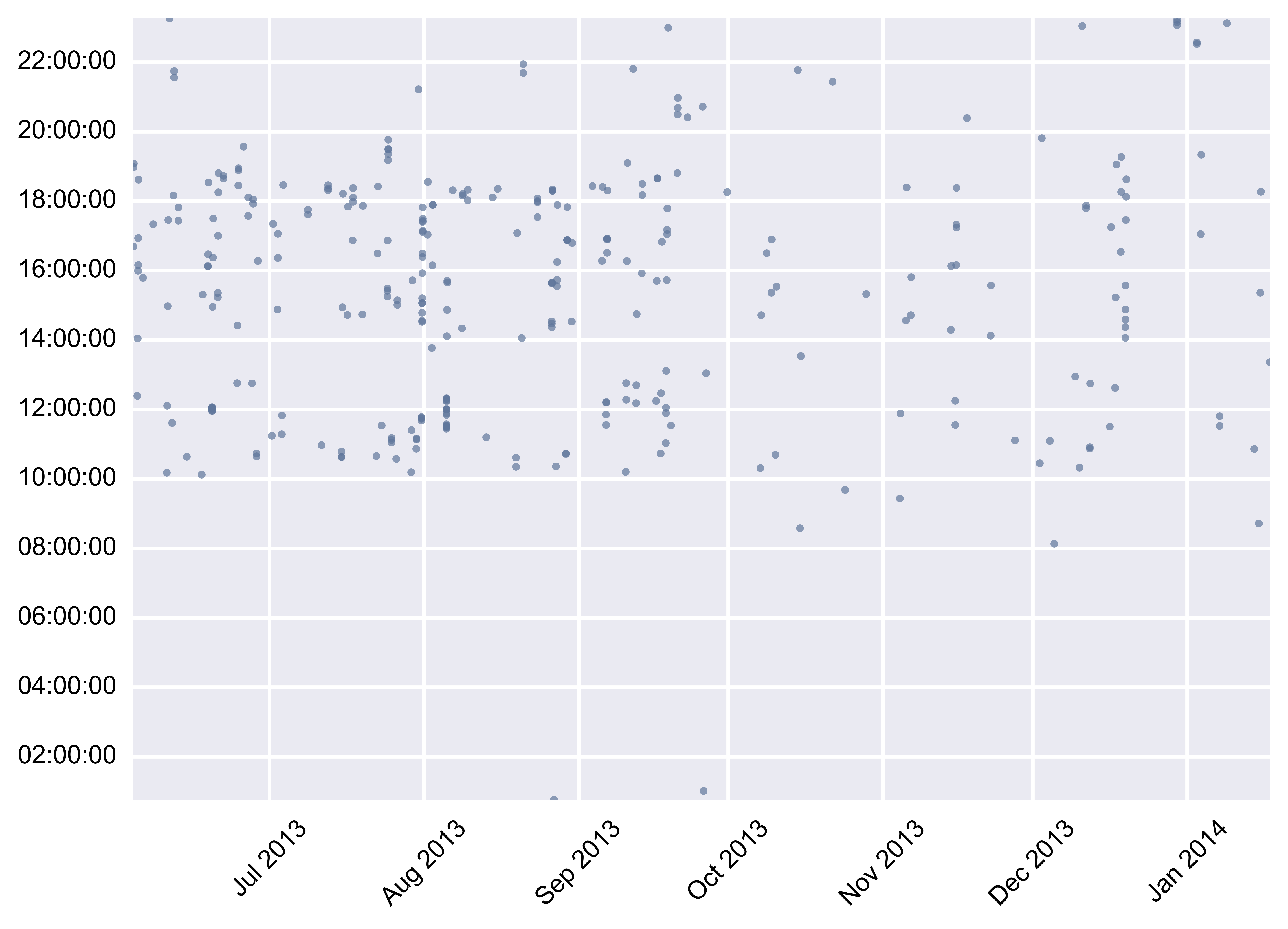
What is more is of course whom I contacted, what tasks or projects that I worked, what type of emails I received and sent. However, even without context, even without using actual data, I could go this far. With recent acquisition of Nest, Google not only has our online activity(search, email) but also physical activities which it is fundamental to complete the cycle.
What is next?
What is next is to infer the activities from data and predict what we will do next. In order to do that, Google needs abundant data which it already has and machine learning algorithms that are effective for unlabeled and large amounts of data, which it acqui-hires top-notch researchers Geoffrey Hinton, DeepMind in order to enable just that.